Link to mood board
https://padlet.com/natherley1220201/i7k6yoh33bg2dd7w
Sketches

The Ocean in the camera view. This is the Ocean and background test to see if the colours a too similar to each other. The light is placed to see how the relfcetion projcets it’s self on the Ocean.
Version 1
For my first version I chose to go with a warm beachy vibe, and it worked well.
Version 2
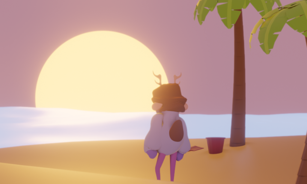
So, for the second version I tried to do a cooler tone in the background that has a more purple tone to it.
Version 3
For the third version, I tried to make it be the sunset is hazier and give the sun more deep orange, while the background is more of a dark purple and it makes the light look more real, it has all the going to the sun.
Version 4
For the 4th version, I put a film grain as an overlay for the beach background I do not really think it worked well.
Version 5
For the fifth one, I just went a bit crazy with it, and I just made everything super bright, which was a bit stupid because it is kind of it makes your eyes hurt. It is there is a bit of eyestrain to the colours, so it was not really my best attempt.